The Inspiration of Saint Matthew
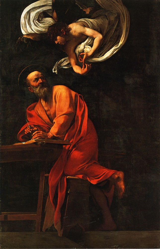
I have a print of this painting on my wall at home so I spend a lot of time looking at it, mostly from having my ironing board set up in front of it. It is an altar of sorts, which is apt because is at the centre of three paintings in the Contarelli Chapel of San Luigi dei Francesi in Rome. The canvases tells stories from the life of Saint Matthew; The Calling of Saint Matthew and The Martyrdom of Saint Matthew being the other two subjects. Since visiting Rome two years ago I have felt that these are among Caravaggio’s best and most coherent works, to which the centerpiece, The Inspiration of Saint Matthew, is the key.
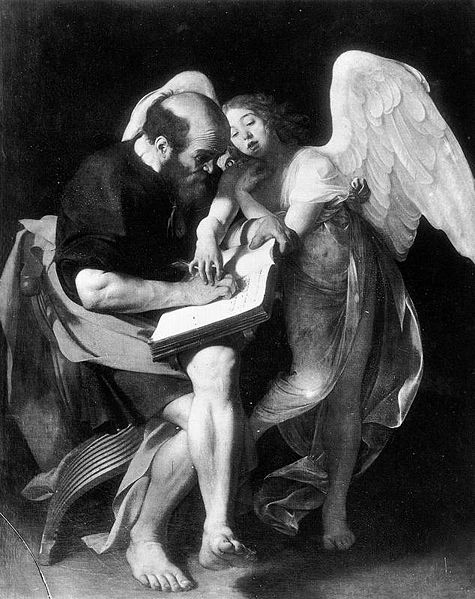
Interestingly, the paintings made for the chapel were among Carvaggio’s first public works. His private patrons accepted his style and radical ideas, commissioning and collecting his works avidly. But to paint for the Catholic Church, which had its own established visual rules, was a different matter. The Inspiration of Saint Matthew was ordered after Caravaggio had completed the first two paintings, as the work originally intended for the altarpiece was abandoned. Famously, the initial painting Caravaggio submitted (Saint Matthew and the Angel, shown below) was rejected on the basis that it was blasphemous. From an existing black and white photo you can see why.
In the second take, we can see that Caravaggio reworks the painting to adhere to Catholic traditions without compromising his uniquely dark and intense take on religious subjects. The Inspiration of Saint Matthew (1602) is slimmer and more vertically composed, emphasising the positioning of the figures. The descending angel’s body creates a curve, which is continued in the opposite direction by the saint, giving a serpentine movement down the canvas. The angel’s swirling white robes and the shock of Saint Matthew, who pushes back on his stool add motion to the dynamic composition. Their gazes meet in a serene understanding, and their hands tell us what is being said without words. It is simple but powerful.
Matthew appears as an elegant scholar in this version, opposed to the indecorous peasant in the first. Yet the artist manages to retain his characteristic realism (albeit a cleaned-up version of it) and eliminates any awkwardness in the merging of the heavenly and earthly realms. He includes enough iconography to make it readable, yet refrains from the typical Catholic visions of rosy-cheeked cherubim and the golden light of divine intervention. Caravaggio interprets bible stories in a way that is fresh and relatable. It feels immediate and modern. He includes us in the scene by forcing it into our space through the unbalanced stool. Darkness envelopes the background, giving the lit figures a theatricality, removing distractions and leaving us space to contemplate the drama of the miraculous episode.


